-
Welcome to Brock Corydon Daycare!
-
We chose the picture of the dragonfly as it symbolizes change, growth and transformation.
Our website begins with a picture of a child’s hand cradling a dragonfly. You sense the instant the dragonfly has landed it has awakened a feeling of wonder in the child. As you witness the awe inspiring event you can hear the child’s questions as they echo in your mind.
“I wonder how it flies in every direction and hovers in a single spot”.
“I wonder how it reflects multiple colors”.
And then just as quickly as it has landed the dragonfly is gone, but the experience of wonder has remained.
A child engaged in learning through the senses creates opportunities for personal growth.
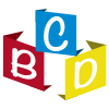
Our logo is comprised of lettered building blocks. The building blocks represent the foundation for learning and the role that blocks play in developing creativity and educational experiences for children. The use of primary colors in our logo and throughout the website is significant. Red signifies excitement and energy, yellow instills fun and playfulness and blue evokes security and calmness. While these three colors cannot be made by mixing any other colors; mixed together they create a rainbow of colors.
This celebration of colors encourages us to celebrate each child’s uniqueness in a diverse and inclusive environment.
-